nativescript-materialdropdownlist
适用于 NativeScript Apps 的 Material 风格下拉列表 XML 小部件
npm i --save nativescript-materialdropdownlist
- 版本:1.0.15
- GitHub: https://github.com/bradleygore/nativescript-materialdropdownlist
- NPM: https://npmjs.net.cn/package/nativescript-materialdropdownlist
- 下载
- 昨天: 0
- 上周: 0
- 上个月: 0
nativescript-materialdropdownlist
适用于 NativeScript 的 Material 风格下拉列表小部件
用法
通过在项目根目录下运行此命令来安装插件:tns plugin add nativescript-materialdropdownlist
<Page xmlns="http://schemas.nativescript.org/tns.xsd"
xmlns:MDL="nativescript-materialdropdownlist">
<StackLayout>
<GridLayout rows="auto" columns="*, auto">
<StackLayout>
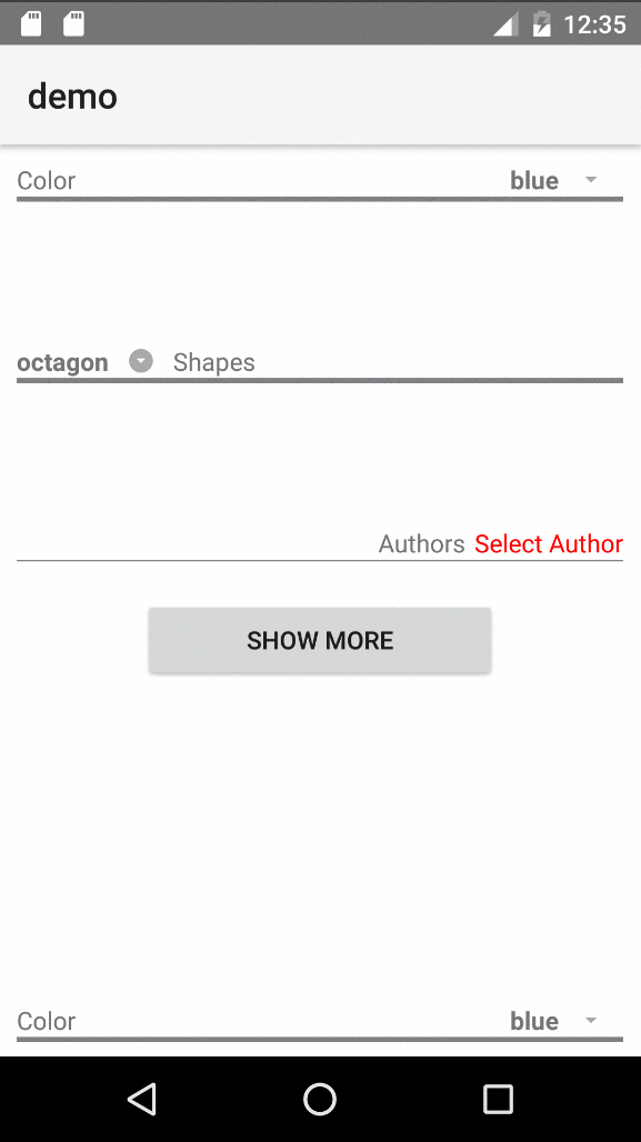
<label text="Color" />
<label style="height: 3; background-color: gray;" />
</StackLayout>
<!--Dropdown List widget-->
<MDL:MaterialDropdownList col="1" id="ddlColors"
itemsSeparatorColor="transparent" itemsRowHeight="30"
items="{{ colors }}" selectedIndex="{{ selectedColorIndex }}" >
</MDL:MaterialDropdownList>
</GridLayout>
</StackLayout>
</Page>属性
| 名称 | 描述 | 值类型 | 默认值 |
|---|---|---|---|
| items | 要绑定到数据源的项列表 | Array 或 ObservableArray | null |
| id | (可选)添加到生成的 ListView 的 ID 前面,格式为 {id}_pickerList | string | '' |
| iconText | (可选)用于图标标签的文本 | string | '\ue5c5'(来自 Material Icons 的标准下拉图标) |
| itemsSeparatorColor | (可选)传递给 ListView 以设置分隔项的线条颜色 | string (Color) | ListView 的默认值(浅灰色) |
| itemsRowHeight | (可选)传递给 ListView 以设置列表中每个项的高度 | number | ListView 的默认值 |
| selectedIndex | (可选)当前选中项的索引 | number | null |
| targetViewId | (可选)用于背景(AbsoluteLayout)和 ListView 渲染的目标视图。这对于在标签页视图和模态视图中使用小部件以获得最佳效果是必需的 - 请参阅示例 | string | null |
| indexChange | (可选)当选中索引更改时调用的函数 | 函数 | N/A(使用视图事件 .notify() 机制) |
自定义模板
此小部件旨在具有灵活性,因此您可以为提示视图(用户点击以展开下拉列表的视图)以及为 ListView 中的每个项定义视图模板使用自定义模板。
如果项的列表不是字符串,而是对象,则需要使用这些自定义模板。
<MDL:MaterialDropdownList col="1" id="ddlAuthors"
    items="{{ authors }}" selectedIndex="{{ selectedAuthorIndex }}" >

    <!--Prompt or Selected Item Template-->
    <MDL:MaterialDropdownList.selectedItemView>
        <StackLayout>
            <label text="{{ selectedAuthor ? selectedAuthor.name : 'Select Author' }}" style="color: red; padding-left: 5;" />
            <label style="background-color: gray; height: 1;" />
        </StackLayout>
    </MDL:MaterialDropdownList.selectedItemView>

    <!--Template to pass to the ListView-->
    <MDL:MaterialDropdownList.itemsTemplate>
        <label style="color: red; padding-top: 5; padding-bottom: 5;" text="{{ name }}" />
    </MDL:MaterialDropdownList.itemsTemplate>
</MDL:MaterialDropdownList>
默认提示视图
如果您不使用自定义模板,我们仍然考虑了设计性。默认提示视图的元素都具有特定的目的和唯一的 ID 和 CSS 类,以便于样式化。如果有一个 XML 模板,如下所示:
<grid-layout rows="auto, auto" columns="*, auto" id="mdlLayout" class="mdl-container">

    <!--Label where the value from the selected item gets put-->
    <label id="mdlSelectedValue" row="0" col="0" class="mdl-value" />

    <!--Label where the icon text gets put-->
    <label id="mdlIcon" row="0" col="1" class="mdl-icon" />

    <!--Label to hold no next but act as an underline across the entire widget - i.e. set height and background-color in a style rule-->
    <label id="mdlUnderline" row="1" col="0" colSpan="2" class="mdl-underline" />

</grid-layout>
样式
这些下拉列表的样式非常简单。只需根据上面显示的类和 ID 创建 CSS 规则。鉴于这些类型列表的动态性质,您可能希望为所有下拉列表设置标准高度,幸运的是,还有一个特定的 CSS 类用于这些:mdl-pickerList。以下是一些可以用来样式的示例:
.mdl-backdrop {
    /*The AbsoluteLayout that acts as backdrop to the dropdown*/
    background-color: lightgrey;
}

.mdl-pickerList {
    /*common styles for ALL dropdown lists*/
    height: 80;
    min-width: 60;
    background-color: white;
    border-color: blue;
    border-width: 1;
}

/*different styles for specific lists - remember ID is container's ID + _pickerList*/
#ddlColors_pickerList {
    border-color: silver;
}

#ddlShapes_pickerList {
    border-color: orange;
    border-width: 4;
    min-width: 80;
}

#ddlAuthors_pickerList {
    min-width: 200;
}

#ddlShapes_pickerList label {
    /*If a custom itemsTemplate is not used, ListView defaults to a Label*/
    padding-top: 4;
    padding-bottom: 4;
    padding-left: 2;
    color: blue;
}
示例
要从本地运行示例,请在拉取此存储库后从根目录运行以下命令:npm run setup 和 npm run demo.android